
Overview
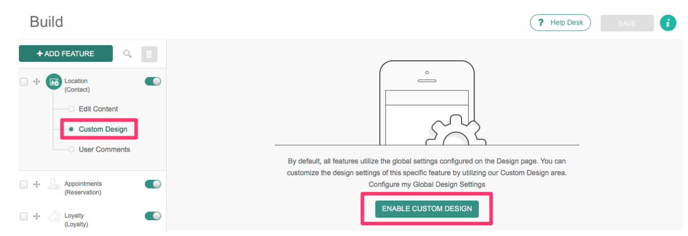
The Custom Design area appears within the Build step of the app dashboard under each feature. Here you can override the Global Design and utilize our custom design for each feature. For example, if you would like to assign a unique background image or adjust the color scheme for the Fan Wall feature, you can do so here.
This article provides information on the different options available to enable you to create custom designs.
Process
To begin creating your custom design, just click Enable Custom Design. The design options will appear as below:
Navigation Buttons
Customize the button that appears next to your feature in list view.
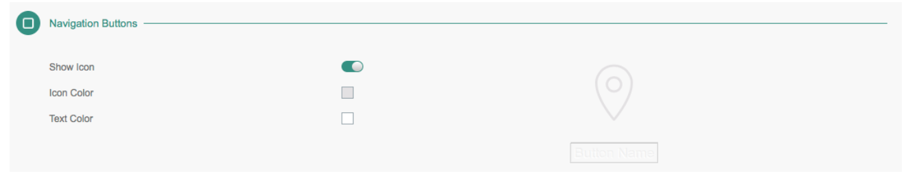
| Item | Description |
| Show Icon | Toggle on to display feature icon. |
| Icon Color | Select the feature icon color. |
| Text Color | Select the Button Name text color. |
Screen Styling
Customize the in-feature header, background, and style.
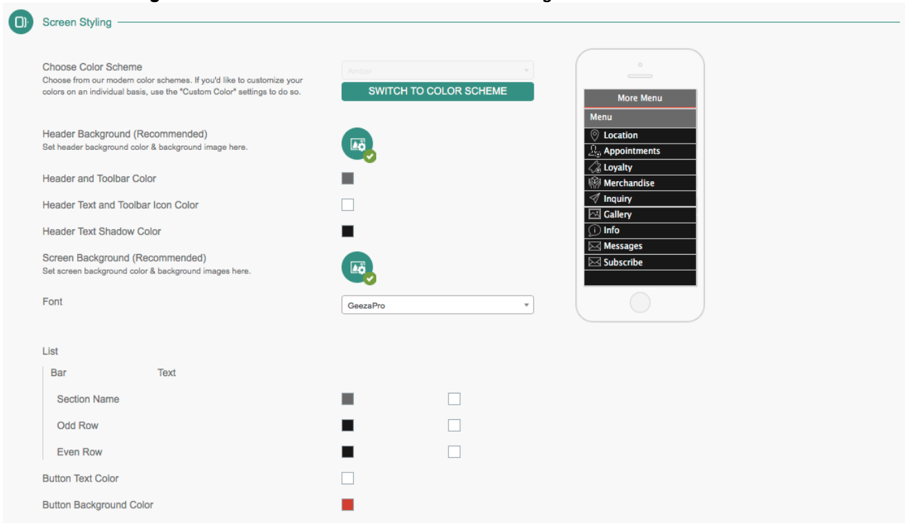
| Item | Description |
| Choose Color Scheme | Choose from our modern color schemes. If you would like to customize your colors on an individual basis, use the Custom Color settings to do so. |
| Header Background | Click the icon to select the header Background Color, set the Image Overlay Opacity, and select or upload a header Background Image. |
| Heder Text and Color | Select the feature header text color. |
| Header Text Shadow Color | Select the feature header text shadow color. |
| Screen Background | Click the icon to select the feature background image and enable/disable the Blur Effect. You can select or upload a Screen Background Image here. |
| Font | Select the font for the in-feature content. |
| List Color Theme | Select a color theme for the feature or customize each color setting individually below:
|
| Button Text Color | Select the in-feature Button Text Color. |
| Button Background Color | Select the in-feature Button Background Color. |
Once you have adjusted your settings as desired, click Save at the top to apply your custom design model. This can be reverted back to the Global Design at any point by clicking Use Global Design > Save.