
Overview
The Custom Form feature is a great solution for generating customer feedback, taking appointment/reservation requests, and gathering info from users in general. You can select from field options, adapt existing options to meet your needs, and customize the design of the form to create your perfect submission form.
Another alternative feature – the WuFoo Form feature – is also a great option if you are looking for more custom features than what is available in our native options.
This article provides the steps on how to add and configure the Custom Form feature in your app.
Information
This feature is available on the following platforms:
- iOS
- Android
- HTML5
This feature is recommended for the following industries:
- Law Firms
- Schools
- Service Providers
Monetization ideas:
- If you offer custom-priced services or products that are not well-suited to the Merchandise feature, the Custom Form feature can act as an interest or request form.
- Consider running contests or sweepstakes through the app that require the user to submit something through the Custom Form feature.
Related features:
Process
To set up the Custom Form feature, follow the steps below:
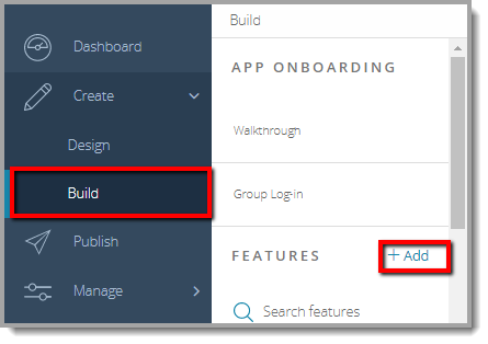
- Navigate to the Build section of your dashboard.
- Click Add Feature.
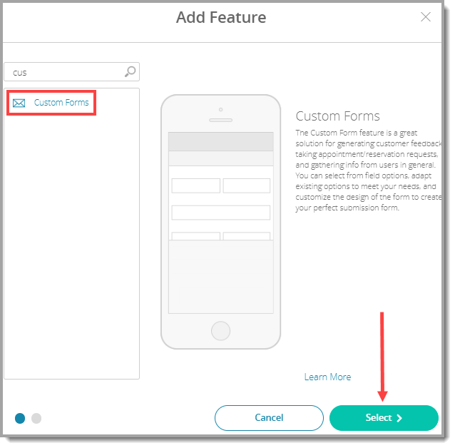
- Choose Custom Forms from the menu, then click Select.
- Name your feature, then click Add. Your new feature will now appear in the left-side menu of the CMS.
- Click on the feature to expand its menu.
- Jump to a specific section, Content, or Custom Design to adjust the feature settings.
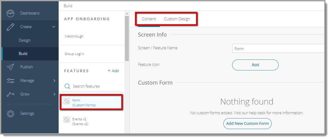
- Jump to a specific section, Content, or Custom Design to adjust the feature settings.


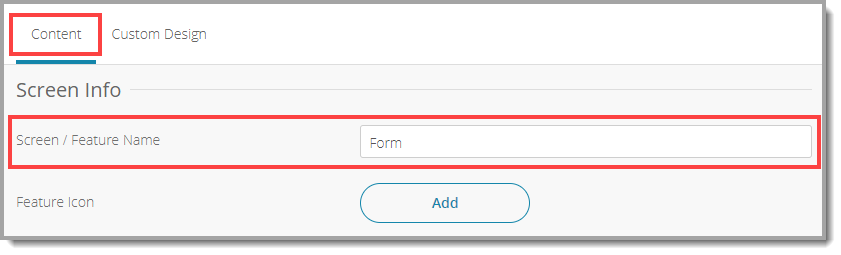
Content
Here you can rename the feature and add forms.
- Under Screen Info, change your Screen / Feature Name or leave as-is. This is the name that will appear in the app’s feature menu (e.g., Feedback instead of Custom Form).
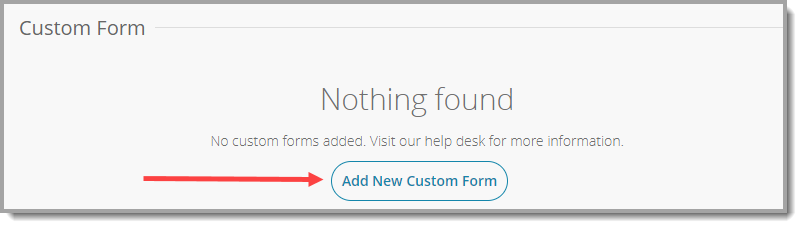
- Under Custom Form, click Add New Custom Form. Complete the sections below, then click Add. Repeat this process for each form.
- Configure the Add New Custom Form.
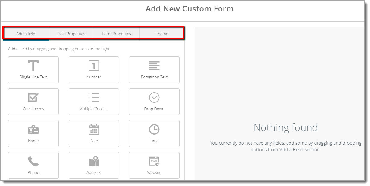
- The following table describes each of the options available in the four tabs, Add a field, Field Properties, Form Properties, and Theme.
Tab Description Add a field Drag and drop your desired fields from the left-side menu onto your form on the right. You can remove a field by clicking the trash can icon at its bottom right. Field Properties Click any field on the right side to view its individual properties. You will see a preview of your changes on the right. - Field Label: Give the field a name.
- Field Size: Set the width of the input field to small, medium, or large.
- Required: Check this box if you want to make this field mandatory. If checked, users will not be able to submit the form without completing it.
- Guidelines for User: Provide field-specific instructions for the user. This will appear next to the field when they select it.
- Choices: List the choices users can select from (this property applies to the Checkboxes, Multiple Choices, and Drop Down fields).
- Format: Select the appropriate time, phone number, or currency format (this property applies to the Time, Phone, and Price fields).
Form Properties This is where you control the form’s main settings. Complete each field below: - Send To: Specify the email address that will receive user submissions.
- Email Subject: Select a subject name for user submission emails (e.g., User Feedback).
- Form Title: Name your form. This will appear in the feature’s list view within the app.
- Description: Describe the purpose of this submission form for your users. Be specific!
Example: We love to hear from our clients. Please fill out this form if you have any valuable feedback about our services. - Success Message: This is what users will see after they complete and submit the form successfully.
- Error Message: This is what users will see if they try to submit without completing all required fields.
- Submit Button Label: This text will appear on the submission button.
- Back Button Label: This text will appear on the back button.
Theme Adjust the color, font, and border settings of your form here. Use the preview on the right to check out your changes. - Color: Select colors for each aspect of your form.
- Font: Select fonts for your form’s text.
- Border: Adjust the color and width of the border that appears between sections.
- Click Save at the top right when you are done.
Custom Design
If you would like to create a custom design for this feature instead of using the Global Design, please refer to the article Feature: Custom Design Area.