
Overview
The 1-Tier Info feature is essentially a blank slate in which you can enter any content you would like from text and images to embedded videos and hyperlinks. If you want to display general information or have anything you want to include in your app that does not fit another feature or Web Site feature, you probably want this!
In this article, you will learn how to set up this feature in your app.
Information
This feature is available on the following platforms:
- iOS
- Android
- HTML5
This feature is recommended for the following industries:
- Literally any industry could benefit from this feature!
Monetization ideas:
- Allow affiliates and partners to advertising or special offer pages within your app!
Related features:
Process
To set up the 1-Tier Info feature, follow the steps below:
- Navigate to Edit > Build on your dashboard.
- Click Add Feature.
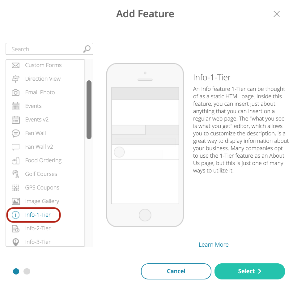
- Choose the Info-1-Tier feature from the menu, then click Select.
- Name your feature, then click Add. Your new feature will now appear in the left-side menu.
- Click on the feature to expand its menu. From the left-side menu you can do the following:
- Use the checkbox to delete the feature.
- Click and drag the arrow icon to rearrange.
- Edit the feature icon by clicking it, then selecting a new image from the fly-up menu.
- Toggle the feature on/off.
- Jump to a specific section (e.g Content or Custom Design) to adjust the feature settings.
Content
Here you can rename the feature, enter content, adjust the appearance and choose whether or not to allow commenting.
- Under Screen Info, change your Screen / Feature Name or leave as-is. This is the name that will appear in the app’s feature menu (e.g. About Us instead of Info 1-Tier).
- Under Info 1 Tier:
- Color Settings:
- Toggle between the use of global color settings or unique colors for this feature.
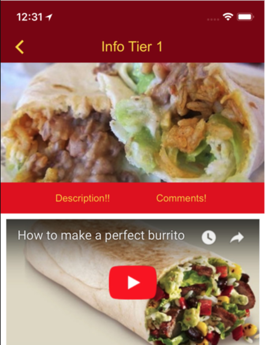
- Header & Comment Sections:
- Toggle this ON to split the feature between the header image and body and to allow users to leave comments regarding the feature’s content.
- When this is toggled ON, you must upload a Mobile Header Image and Tablet Header Image.
- Description: Use the WYSIWYG editor to enter the content this feature will display.
- Color Settings:
- Click Save at the top right when you are done.
Custom Design
If you would like to create a custom design for this feature instead of using the Global Design, please refer to the article Feature: Custom Design Area.
Comments
User comments will appear in this section with the date, username, and comment text.
Example