
Overview
The Info feature is essentially a blank slate in which you can enter any content you would like from text and images to embedded videos and hyperlinks. If you want to display general information or have anything you want to include in your app that does not fit another feature or Web Site feature, you probably want this!
In this article, you will learn how to set up the 3-Tier Info feature in your app.
Information
The 3-Tier Info feature is categorized into three tiers, with the third tier showing the most information and the first two being used for organization.
To illustrate:
ITEM LIST/CATEGORIES (Tier 1) → ITEM LIST/SUB-CATEGORIES (Tier 2) → ITEM DETAILS (Tier 3)
This feature is available on the following platforms:
- iOS
- Android
- HTML5
This feature is recommended for the following industries:
- Literally any industry could benefit from this feature!
Monetization ideas:
- Allow affiliates and partners to advertising or special offer pages within your app!
Related features:
Process
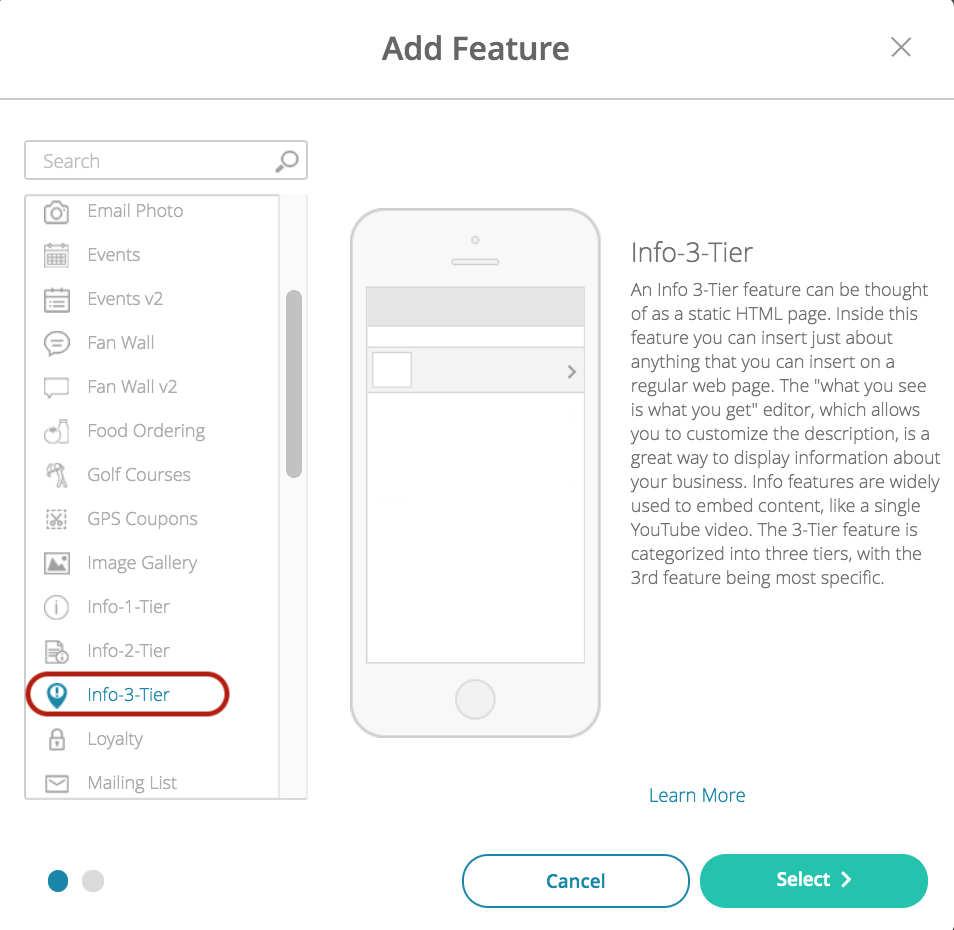
To set up the 3-Tier Info feature, follow the steps below:
- Navigate to the Build section in your dashboard.
- Click Add Feature.
- Choose the 3-Tier Info feature from the menu, then click Select.
- Name your feature, then click Add. Your new feature will now appear in the left-side menu.
- Click on the feature to expand its menu. From the left-side menu you can do the following:
- Use the checkbox to delete the feature.
- Click and drag the arrow icon to rearrange.
- Edit the feature icon by clicking it, then selecting a new image from the fly-up menu.
- Toggle the feature on/off.
- Jump to a specific section (e.g. Content or Custom Design) to adjust the feature settings.
Content
Here you can rename the feature, enter content, adjust the appearance and choose whether or not to allow commenting.
- Under Screen Info, change your Screen / Feature Name or leave as-is. This is the name that will appear in the app’s feature menu (e.g. Company History instead of Info 3-Tier).
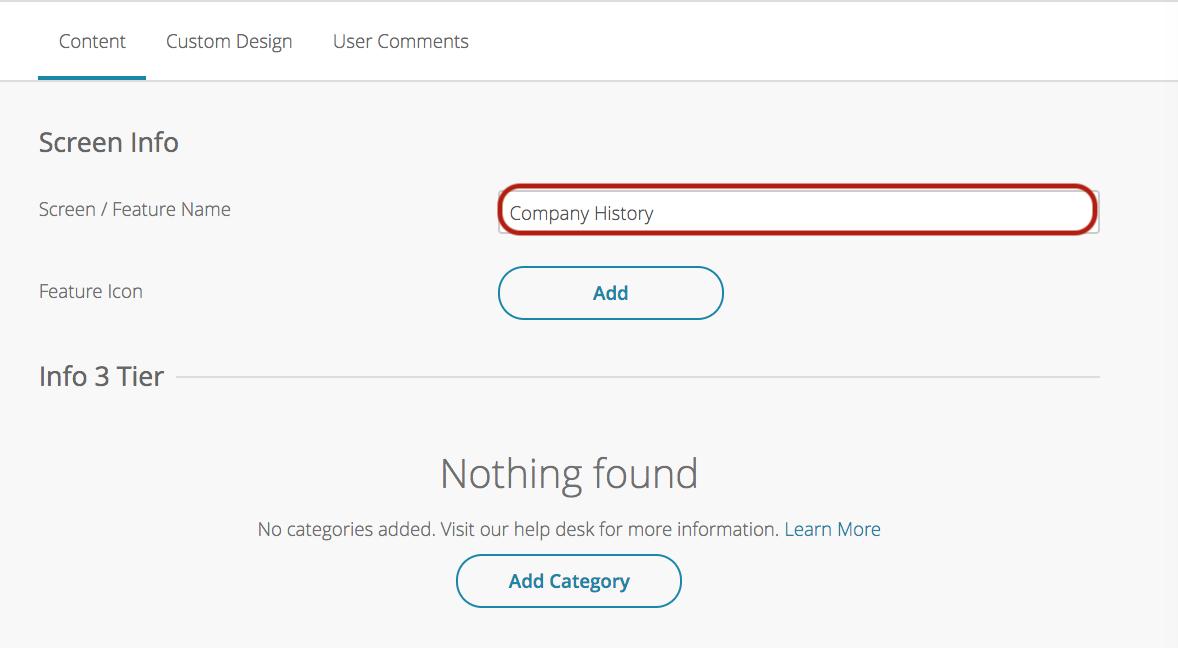
- Under Info 3 Tier, click Add Category. Complete the fields then click Add. Repeat this process for each location/directory.
- Section Title to Categorize Information:
- Input the name for your broadest category (e.g. Products or Services).
- The section title will appear as header bars above and between category links on the first page.
- Multiple categories can have the same Section Title and will then be grouped together.
- Category Name:
- This is the name for the specific category that will act as a link to take the user to the list of items (e.g. Home Cleaning or Cleaning Supplies).
- Check the Active box to enable your time. If the box is unchecked, this item will not appear in the app.
- Thumbnail:
- Upload a custom thumbnail (140x140px).
- Section Title to Categorize Information:
- Under Add Item, complete the fields below, then click Add. Repeat this process for each item.
- Color Settings:
- Toggle between the use of global color settings or unique colors for this feature.
- Mobile Header Image:
- Upload or select a mobile header image (640x264px in PNG format) for the item.
- Tablet Header Image:
- Upload or select a tablet header image (1536x634px in PNG format) for the item.
- Section Title to Categorize Information:
- All items with the same Section Title will be grouped together under a heading that displays the word or phrase entered in this field.
- Organization of items in your 2-Tier Info feature will be alphabetical by Section Title, then alphabetical again within each section.
- Item Name:
- This will display on the list of items as the clickable link to view the content for that item.
- Header & Comment Sections:
- Toggle this ON to split the feature between the header image and body and to allow users to leave comments regarding the feature’s content.
- When this is toggled ON you must upload a Mobile Header Image and Tablet Header Image.
- Description:
- Use the WYSIWYG editor to enter the content this feature will display.
- Thumbnails Image:
- This image will be displayed on the list of items next to the Item Name.
- Color Settings:
- Click Update when adding or editing an item then Save at the top right when you are done.
Custom Design
If you would like to create a custom design for this feature instead of using the Global Design, please refer to the article Feature: Custom Design Area.
Comments
User comments will appear here with the date, username, and comment text.